Some Tips on Coding Web Designs Better
Writing semantic, efficient and valid HTML and CSS can be a time-intensive process that only gets better with experience. While it is important to take the time to produce high-quality code — as it is what separates professionals from hobbyists — it is equally important to produce websites as expeditiously and efficiently as possible.
As web designers, we’re always looking for ways to be more productive. Getting more work done in less time while at the same time maintaining (or improving) our products’ quality is a lifelong quest for many of us.
This article discusses a few fundamental techniques for writing high quality and efficient HTML and CSS.
Use Templates and Frameworks (Even If It’s Homemade)
Using templates and frameworks provides you with a solid baseline from which to start from. For example, CSS frameworks such as the 960 Grid System and Blueprint can save you time in having to write code for bulletproof web page layouts. The purpose of a framework is to reduce development time by avoiding having to repeatedly write cross-browser-tested code for each of your projects. However, take note: Using frameworks involves a learning curve and can bulk up your web page sizes with unnecessary style rules and markup.
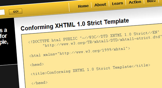
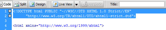
Even something as simple as using this XHTML 1.0 strict template — a skeleton for your HTML documents — can be a time-saver.
Whether you choose to use a premade framework or not, the notion you should take a note of is just how much code you end up writing over and over again. It’s imperative to discover these repetitive tasks so that you can come up with a system (a custom template/framework) to help you speed up your workflow.
Conform to XHTML 1.0 Strict Doctype
Writing under the Strict doctype forces you to produce smarter and specifications-conformant code. Strict doctype lowers your desire to use hacks, deprecated elements, proprietary code, and unconventional markup that in the future will give you grief and maintenance costs related to debugging and updating projects.
Strict doctype also instructs web browsers to render your web pages under strict W3C specifications, which can reduce browser-specific bugs and thus lowering your development time.
Use Good and Consistent Naming Conventions
Always use consistent naming conventions for easier organization and so that you can produce work that is meaningful and expressive.
For example, if you use hyphens (-) to separate words in your classes and IDs (e.g.
sidebar-blurb, about-us), don’t use underscores (_) for others (e.g. footer_nav, header_logo). Also, using standard and meaningful filenames for documents and directories is a good practice to get into.Here are some popular classes, IDs and file names:
- Structural IDs:
#header,#footer,#sidebar,#content,#wrapper,#container - Main stylesheet: style.css, styles.css, global.css
- Main JavaScript library: javascript.js, scripts.js
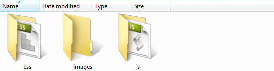
- JavaScript directory: js, javascript or scripts
- Image directory: images, img
- CSS directory: css, stylesheets, styles
Always use meaningful words for your IDs and classes. For example, using
left-col and right-col for div ID attribute values isn’t good because they rely on positional factors rather than semantics. Using something that has greater semantic value such as main-content or aside would be better so that you are giving your layout elements improved meaning and greater flexibility towards changes in the future.In HTML5, the issue of proper naming conventions and uniformity for layout elements has been addressed with the introduction of new HTML elements such as
<nav>, <footer> and <article>, but the concept of using proper naming conventions applies to all HTML elements with ID/class attributes, not just layout elements.Read more about naming conventions in this article called Structural Naming Convention in CSS.
Good naming conventions are just a best practice in general, but as a bonus, it can help you speed up your development process because of organized and intuitive code, which makes finding and editing things quicker.
Understand and Take Advantage of CSS Inheritance
Instead of assigning every single element a
font, color, background, etc., try to take advantage of CSS inheritance rules, especially for fonts, padding and margins. This can reduce the amount of code you have to write and maintain.For example, the following is terser:
html, body {
  background: #eee;
  font: normal 11pt/14pt Arial, Helvetica, sans-serif;
  color: #000;
}
ul, ol {
  font-size: 18pt;
}
Compared to:
html, body {
  background: #eee;
}
p {
  font: normal 11pt/14pt Arial, Helvetica, sans-serif;
  color: #000;
}
ul, ol {
  font: normal 11pt/18pt Arial, Helvetica, sans-serif;
  color: #000;
}
blockquote {
  font: normal 11pt/14pt Arial, Helvetica, sans-serif;
  color: #000;
}
Reset Your Style Rules
One of the biggest time-sinks in web design is debugging browser-specific bugs. In order to ensure that you start off with a solid baseline — and thus avoid differences across web browsers — consider resetting your CSS. Read more about this subject in the article called Resetting Your Styles with CSS Reset.
Just like using CSS frameworks and HTML starter templates, there are several CSS reset templates that you can take advantage of. Here is a couple:
Here is Eric Meyer’s Reset CSS:
/* v1.0 | 20080212 */

html, body, div, span, applet, object, iframe,
h1, h2, h3, h4, h5, h6, p, blockquote, pre,
a, abbr, acronym, address, big, cite, code,
del, dfn, em, font, img, ins, kbd, q, s, samp,
small, strike, strong, sub, sup, tt, var,
b, u, i, center,
dl, dt, dd, ol, ul, li,
fieldset, form, label, legend,
table, caption, tbody, tfoot, thead, tr, th, td {
 margin: 0;
 padding: 0;
 border: 0;
 outline: 0;
 font-size: 100%;
 vertical-align: baseline;
 background: transparent;
}
body {
 line-height: 1;
}
ol, ul {
 list-style: none;
}
blockquote, q {
 quotes: none;
}
blockquote:before, blockquote:after,
q:before, q:after {
 content: '';
 content: none;
}

/* remember to define focus styles! */
:focus {
 outline: 0;
}

/* remember to highlight inserts somehow! */
ins {
 text-decoration: none;
}
del {
 text-decoration: line-through;
}

/* tables still need 'cellspacing="0"' in the markup */
table {
 border-collapse: collapse;
 border-spacing: 0;
}
The best practice for using CSS reset templates is to fill in the property values of "resetted" styles instead of re-declaring them again.
For example, in Eric Meyer’s Reset CSS shown above, the
line-height of web pages on the site is set to 1. If you know that your line-height needs to be 1.5, then you should change 1 to 1.5.Do not do this when using CSS reset templates:
/ * Not good */
body {
line-height: 1;
}
...
body { line-height: 1.5; }
In addition, it’s best to avoid resetting CSS properties using the universal selector (e.g.
* { margin: 0; padding: 0; }) because, performance-wise, it is inefficient and can be resource-taxing on older computers. Read more about using efficient CSS selectors.Use CSS Shorthand Properties
Writing less CSS means saving time. Not only does using shorthand CSS reduce code-writing, but it also lowers the file sizes of your stylesheets, which ultimately means faster page response times. Additionally, shorthand CSS makes your code cleaner and — albeit arguably depending on your preference — easier to read and maintain.
The following are some popular shorthand syntax to memorize and use, with the longhand syntax equivalent preceding it.
Margin and Padding Properties
/* Longhand */
margin-top: 0;
margin-right: 20px;
margin-bottom: 10px;
margin-left: 15px;
padding-top: 0px;
padding-right: 20px;
padding-bottom: 0px;
padding-left: 20px;
/* Shorthand */
margin: 0 20px 10px 15px;
padding: 15px 20px 0;
A quick guide:
- When 4 property values are used –
margin/padding: [top | right | bottom | left] - When 3 property values are used –
margin/padding: [top | left and right | bottom] - When 2 property values are used –
margin/padding: [top and bottom | left and right] - When 1 property value is used –
margin/padding: [top, right, bottom, and left ]
Font Properties
/* Longhand */
font-style: normal;
line-height: 11px;
font-size: 18px;
font-family: Arial, Helvetica, sans-serif;
/* Shorthand */
font: normal 18px/11px Arial, Helvetica, sans-serif;
A quick guide:
- font:
[font-style | font-size/line-height | font-family];
Background Properties
/* Longhand */
background-color: #ffffff;
background-image: url('../images/background.jpg');
background-repeat: repeat-x;
background-position: top center;
/* Shorthand */
background: #fff url('../images/background.jpg') repeat-x top center;A quick guide:
background: [background-color | background-image:url() | background-repeat | background-position];
To discover more shorthand CSS syntax, take a look at the CSS Shorthand Guide.
Put Things in the Proper Place and Order
Always put things in the conventional place, i.e., where best practices and W3C specifications say they should go. For example, it is best practice to reference external JavaScript libraries after external stylesheet references to improve page responsiveness and to take advantage of the nature of parallel downloading.
This is the best way:
<head>
  <!-- CSS on top, JavaScript after -->
  <link rel="stylesheet" type="text/css" href="styles.css" />
  <script type="text/javascript" src="script.js" />
</head>
The suboptimal way:
<head>
<!-- CSS at the bottom, JavaScript on top -->
  <script type="text/javascript" src="script.js" />
  <link rel="stylesheet" type="text/css" href="styles.css" />
</head>
Note that both code blocks above are valid under specs, but one is better than the other.
When writing structural markup, think in terms of top to bottom and left to right because that’s the accepted convention. If a sidebar is to the right of a content area and below a header, then the markup should be organized as follows:
<div id="header">
</div>
<div id="content">
</div>
<div id="sidebar">
</div>
However, if the sidebar is on the left, a better practice would be to organize markup like this:
<div id="header">
</div>
<div id="sidebar">
</div>
<div id="content">
</div>
A caveat to the above is when you are optimizing your work for screen readers. The second code block above means that screen readers will always encounter the secondary content (
#sidebar) before the main content (#content), which can hamper the reading of people that require screen-reading assistive technologies. In this case, you could place #sidebar lower down the document and use CSS for visual positioning (i.e. float #sidebar to the left, float #content to the right).In addition to putting HTML elements in their respective places, it’s also important to organize CSS (again, for easier maintenance and readability). In a way, it should mimic the organization of your markup. For example, the
#header styles should be before the #footer styles. This is a matter of preference, but it is also a conventional way of organizing style rules./* Structural Styles */
#header {
// header properties
}
#header .logo {
//site's logo properties
}
#footer {
// footer properties
}Wait "Tips on Coding Web Designs Better" Part 2
No comments:
Post a Comment